
Design Principles
1.
Shneiderman’s Guidelines
a.
Query Component 가 visual presentation 으로 주어져야 함
b.
Result 도 visual presentation 으로 주어져야 함
c.
즉각적이고 연속적인 피드백이 가능해야 함
d.
포인팅 (지목)으로 선택이 가능해야 함
e.
“Visual Information Seeking Mantra”
•
Overview first, zoom and filter, details on demand
2.
Tufte’s Design Principles
a.
Tell the truth
i.
그림 가지고 속이는 것이 매우 쉽다.
ii.
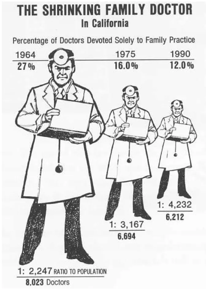
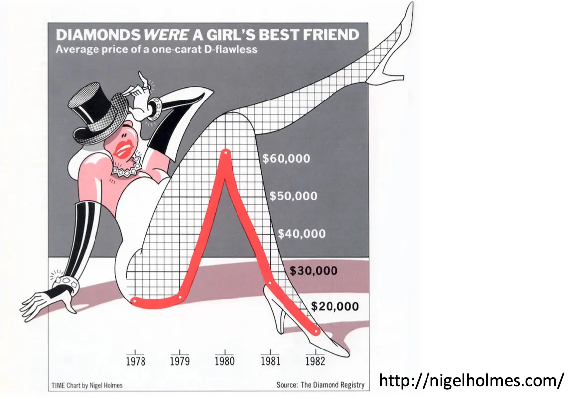
Lie factor: 그림이 얼마나 거짓말을 하고 있는지
b.
Do it effectively with clarity, precision...
c.
“simple design,intense content”
d.
Four Principles
i.
Maximize Data-Ink Ratio
ii.
Avoid Chartjunk
iii.
Use Small Multiples
•
비슷한 graphical element 를 근처에 두어서 차이가 보이게 함
iv.
Utilize narratives of space and time
•
데이터가 주는 space 와 time 에 대한 정보를 잘 드러나게 해야 함
•
v.
Power of Negative Space
•
빈 공간을 잘 활용하는 것이 중요함
vi.
•
Extraneous visual elements that detract from information
•
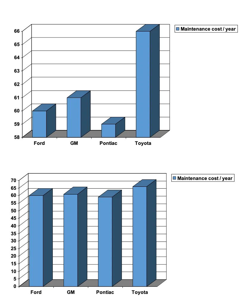
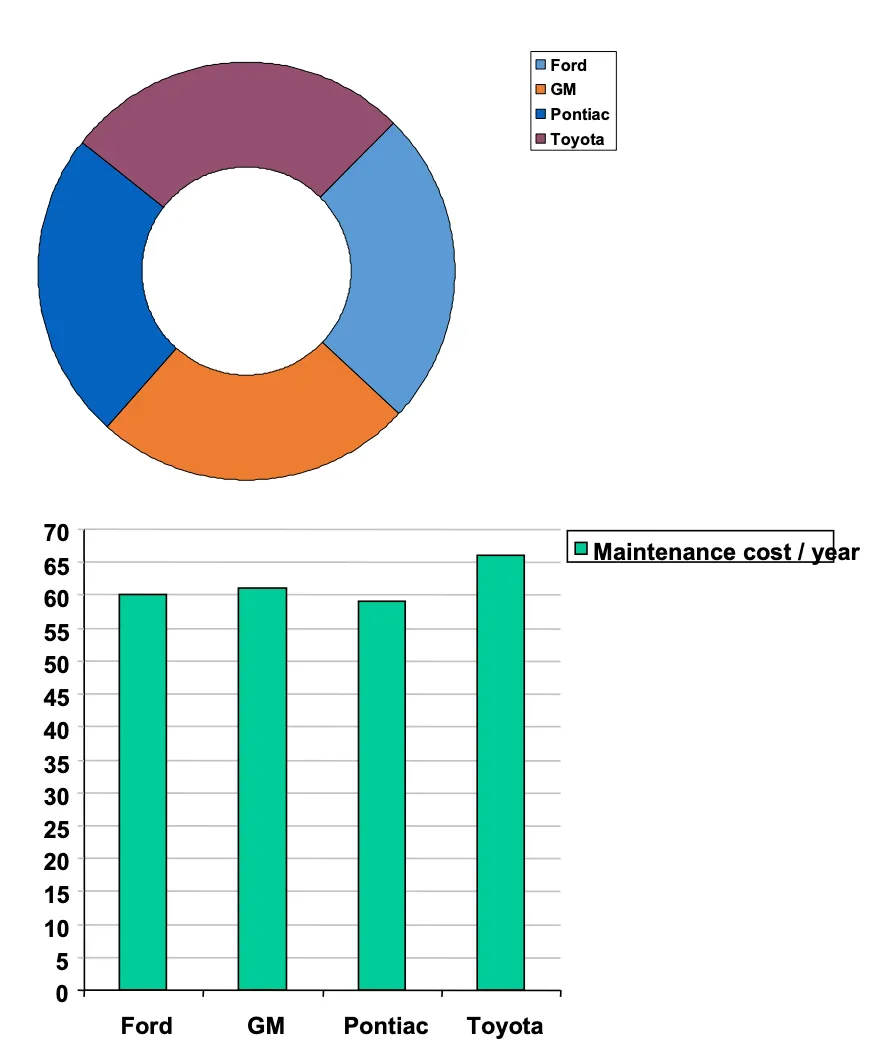
시작 y 축이 0 이 아님
•
원형이라 잘 안보임
•